How to make your Design Simple And Professional
Designing a website is not a big thing, but there a some factors we should consider to make it look simple and professional. Although, these are not significant factors to be followed. You could use your own unique style and could make it trend, if capable. But if you are a beginner i recommend some factors you should consider.
Simplicity
Simplicity is one of the most important factor you had to consider about. It have to be simple to make it user friendly. You should have to consider all kind of users, that anyone could use the site doubtless. People are on your site not to valuate the designing skill you have, but for the piece of information they are looking for. If it looks complicated they would go for another source.
Font
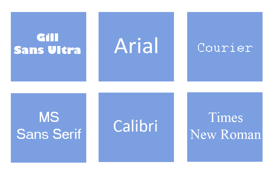
- Choose a font for your site. Stick to one font family throughout the site. You should consider the curves, strokes and other factors of the font. You could choose either plain texts with even stroke width or curved texts with thick and thin stroke width. Its designer’s concern.
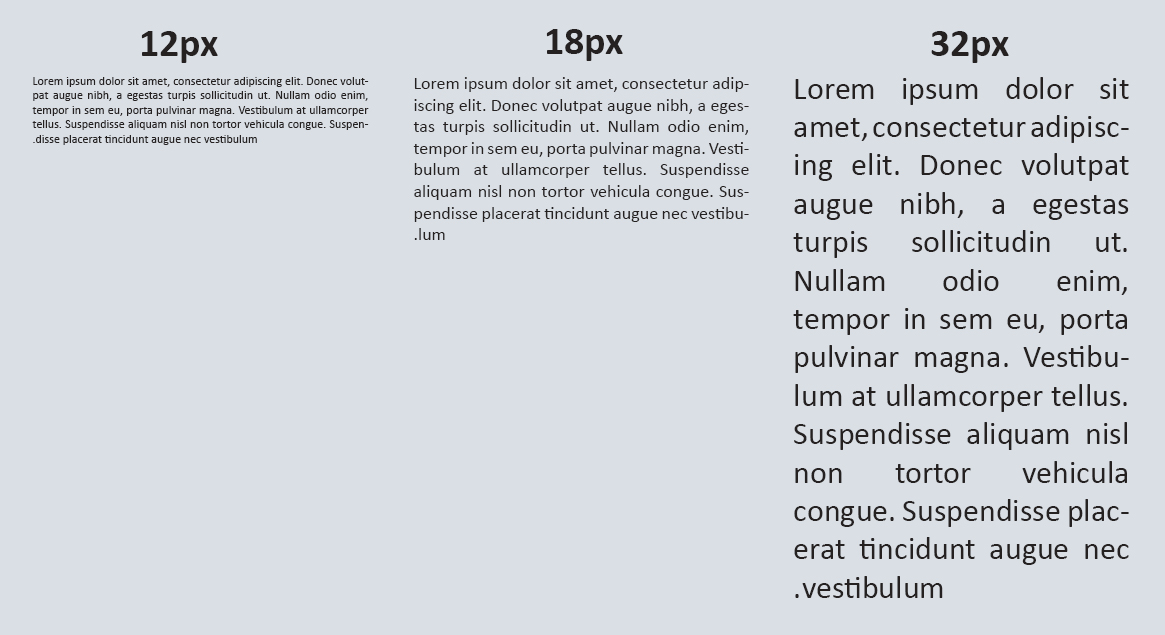
- Another considerable factor is the font size. The font should have to be at a readable size. I prefer choosing font size between 15 px – 25 px is better to make it look readable.
Consistency
The site should have to be consistent throughout. Follow a unique style.
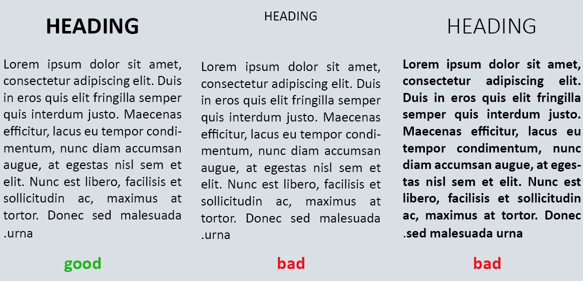
Headings & Paragraphs
- Choose separate font size for headings and paragraphs.
- Use upper case and lower case wisely.
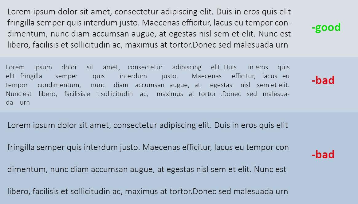
- Also consider the spacing between the lines and within the lines.
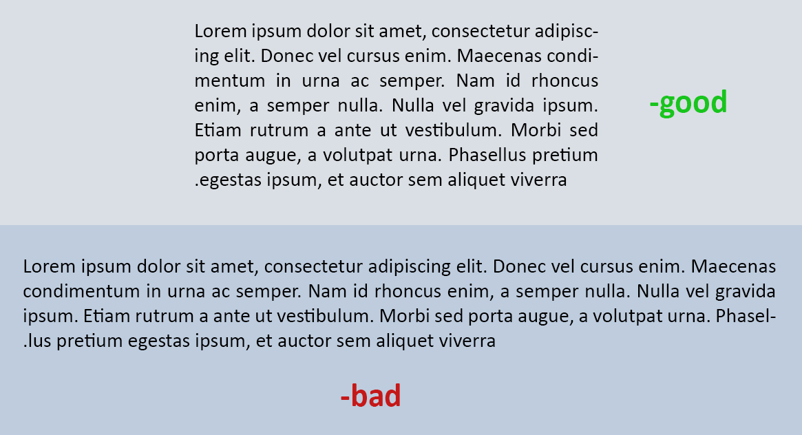
- Paragraph width is also considerable for good reading experience for the user.
Color
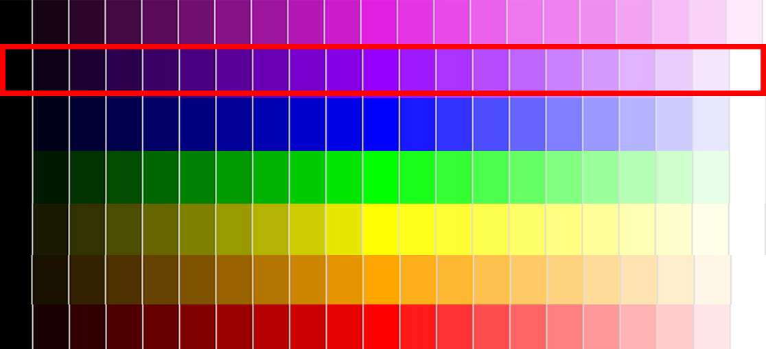
Choosing the color is also a considerable factor. You don’t want to make it fancy, so choose a main color.
Use neutral colors to separate contents. Separating contents is also a good exercise to make it catchy.
Professional
Use simple color contrast and follow uniformity throughout. Try not to make it super fancy.
Responsive
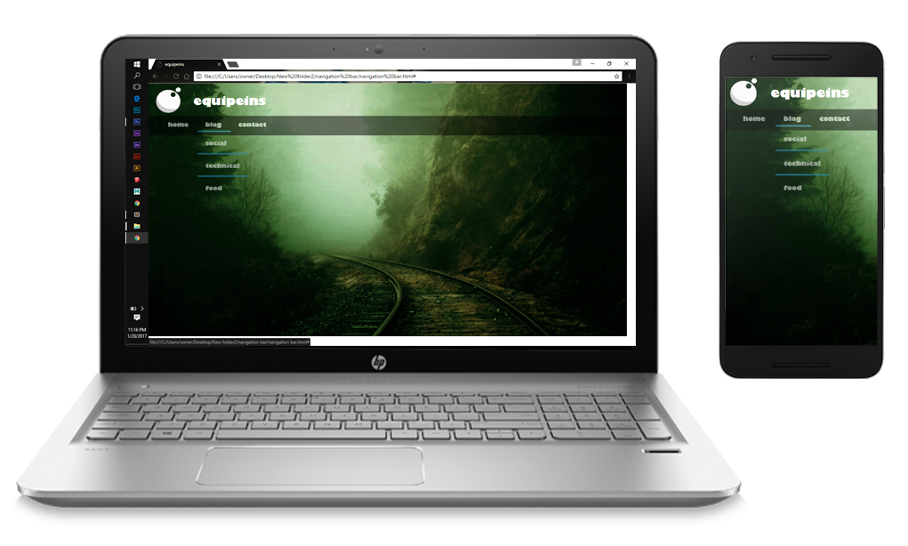
We know that now a days we are using mobiles phones and tablets more than PC or laptops. So the screen size is a considered factor. Make it responsive, be sure that your site works good at small screens. See our Responsive Web Designing tips.
Favicon
Choose a good favicon for your site, either your logo or text as you wish. But use simple, and be sure to add one.
Logo
Choose a meaningful logo. Don’t try to use it every where, it won’t make it attractive. Consider the header and footer where it should be noticeable.
Buttons
Try not to add too many buttons as it would make it complicated. Add hover effects to make user noticeable that it can be clicked. Use simple contrasts for this to look professional.
But there is no “do” and “not to do” stuff in designing. I just suggest some factors that are considerable, but you could try your own unique styles.
thank you!!! Leave suggestions and doubts, have a great day all…
